

Most websites these days are little more than business cards. The trouble is that nobody cares about business cards, and they don't sell. The reason is simple: a business card assumes that your website visitors are already red-hot and ready to buy straight away.
Most visitors, though, are only vaguely interested and don't yet realise that they actually need your service or product. Here I'll explain exactly what you can do to turn lukewarm visitors into hot ones.

What is a sales page?
At its core, a sales page is a web page with one single goal in mind:
Selling. That means you “only” have to focus on that, and you must not distract your visitors.
A good sales page usually has the following structure:
- Header section, which grabs attention
- Problem awareness section, where you make visitors aware of their problem
- Solution awareness section, which shows visitors that you can help them with your product or service.
- Value section: this is where you trigger dopamine (the feel-good hormone) by giving visitors useful tips.
- Trust section: this is where you show testimonials in video and written form
- The CTA (call to action): the main CTA comes right at the end, because by now you have built up everything you need to present your offer.
You can recognise a badly structured sales page by these points:
- The menu or other links lead visitors away from the sales page to other subpages or websites
- No trust is built at all
- Bad sales pages try to sell the offer immediately, without covering the points above first.
Below I'll show you how best to tick off each of these points.
What is the difference between a sales page and a landing page? – Sales page vs. landing page
Sales pages and landing pages are basically the same thing. Both pursue one single goal. The difference is that a sales page focuses on selling, for example your products or your service, whereas a landing page can also exist simply to collect lots of email addresses for a newsletter.
Why are sales pages important for businesses?
If you are launching an online course, a new product, a new app or anything similar, you should definitely create a dedicated sales page for it.
A sales page lets your visitors form a clear picture of your product, and it stops you from distracting them with other subpages and the like.
If you present your product on your regular website instead of on a sales page, visitors will quickly get distracted and end up looking at things that aren't relevant to them at all.
And if you run ads, never point them at your regular website. Every ad should lead to a sales page or a landing page, depending on your goal. This is one of the biggest mistakes I see with ads.
What makes a good sales page and how is it structured?
To create a good sales page, you need the following structure:
- First, you have to capture your visitors' attention immediately, within 5 seconds.
- You have to make it clear to your visitors which problem they have.
- Then you create solution awareness by showing them that your product is the solution.
- Next, we need to give them some real value. It shows that you know what you are talking about, and the dopamine release puts visitors in a positive mood towards your product.
- After that, we use testimonials to build trust in your product.
- Last of all come the offer and the CTA.
Below you'll find out how best to tick off each of these points.
How do you create a successful sales page?
How to structure the header of your sales page
In my opinion, the header is the most important section. This is where you either put visitors off straight away so that they leave, or spark their interest so that they keep scrolling. If the header is bad, it makes no difference how good the other sections are, because this is usually where visitors either drop off or read on.
That's why the header has to do the following within 5 seconds:
Make it clear what this is about: get to the point.
You do that by getting straight to the point in your headline. It's also really important to use plain language, so that within 5 to 7 words it's clear what you do.
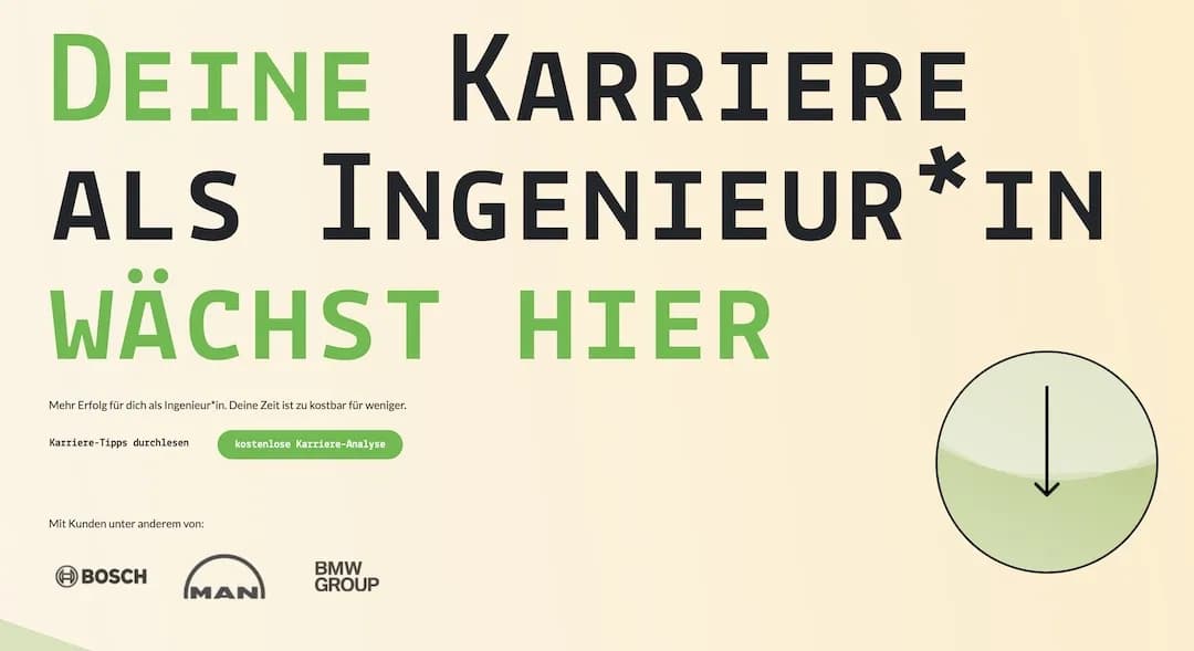
A good example of this is the Ingenieurshelden website. Its headline reads “Deine Karriere als Ingenieur*in wächst hier” (“Your career as an engineer grows here”). When you read that, it's immediately clear what this is about, in just 6 simple words.
A bad counter-example would be a headline like “Welcome to Ingenieurshelden”. Sadly, I still see this kind of headline very often. The problem with it on a sales page is that it doesn't meet people where they are.
When we're looking for information, we all like it when someone gets straight to the point instead of beating about the bush.
The header should also stir emotions
This works best with pictures of people, ideally pictures of you. Even if you sell a physical product on your sales page, you want people to be seen holding it and smiling, for example.
With these pictures, it's also really important to stir emotions through facial expression. Here's one way to do that:
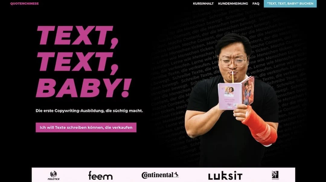
Here you can see my client Stephan Park, copywriter and creator of the copywriting course “Text, Text, Baby!”. He's pulling a face as he peers into his little book. That stirs emotions, not least because it's entertaining.
Even better is when the person in the picture looks towards your headline, to the left for example. Here's an example from my client Björn Kücklich who works as a New Leadership coach.

This creates a psychological effect in visitors known as “gaze cueing”, and it can make a considerable difference to conversion optimisation on your sales page, in other words to optimising your sales.
To see how well this works on your sales page, you can also use A/B testing tools to check whether one version of your picture performs better than the other.
Everyone who sees the picture subconsciously starts looking in exactly the same direction. That helps your visitors find their way around the page faster and draws attention to the things that really matter.
The header also needs to build trust
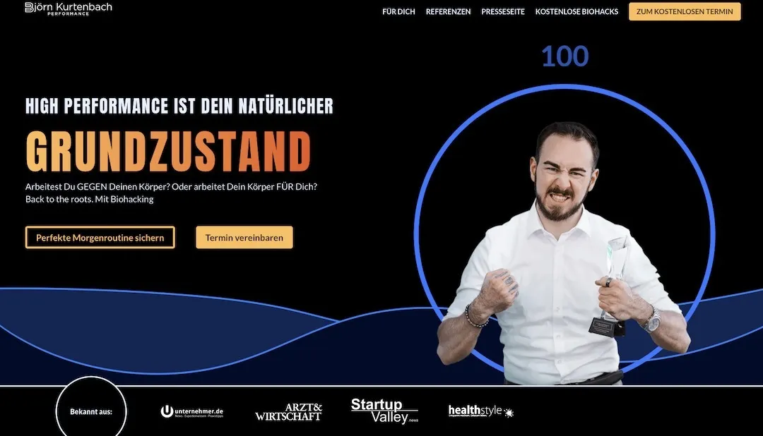
Logos are the best way to do that. Pick, say, the 3 to 5 best-known logos of your best clients and place them prominently in the header of your sales page.
The better known the logo, the better for building trust and, ultimately, for your sales.
If you have been a customer of one of those brands yourself, that increases the likelihood of a sale by up to 400%.
Building trust is hugely important.
Here are a few examples:
Here you can see the Continental logo, for example. It builds a huge amount of trust with everyone, because everybody knows Continental.
A good alternative to the logos of companies you have worked for is the logos of newspapers and magazines you have written guest articles for.
Take Björn Kurtenbach, the high performance and biohacking coach, as an example:
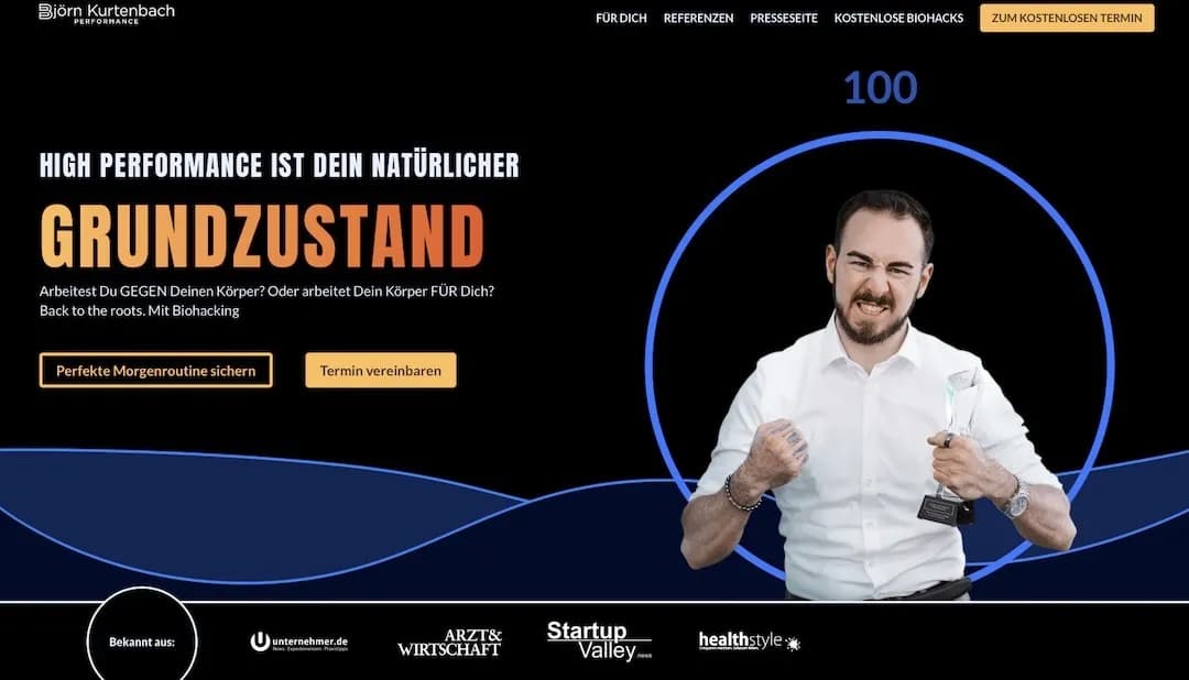
That builds a great deal of trust and makes sure you come across as credible and professional.
It's important to only use logos of people you have genuinely worked with. If you show logos you have nothing to do with and no permission to use, it can get expensive and damage your reputation.
The clear call to action in the header of your sales page
Last but not least, your visitors need to know exactly what they are supposed to do here. That's what a CTA is for.
Here, for example, you can see one CTA below the headline and another in the top right corner. These CTAs also spell out exactly what visitors to the sales page are supposed to do here: book the course.
With your CTA, make sure you write from the visitor's point of view. So instead of using “Book” or “Buy” as your CTA, go for something like “I want to write copy that sells”. Or instead of “Find out more”, use something like “Kris, I want to know how to grab my visitors' attention!”.
That sounds far more interesting and saves visitors from having to think. We want to remove as much friction as possible so that they can concentrate on the decision to buy.
How to build problem awareness on your sales page
You bring out problem awareness by making visitors' problem clear to them. Here it's very important to talk to your target audience beforehand so that you know their problems inside out. And I do mean inside out. Ideally, you know your audience's problems in their exact words.
To find out which problems your target audience has, simply ask them. Ideally in a personal conversation, or with the help of questionnaires.
Make sure you also note down their exact phrasing and use their exact words. Don't make up what the problems might be; you want to know what they actually are.
Armed with this knowledge, you now highlight your target audience's problems in this section. A picture combined with text works best for this.
Like here, for example:
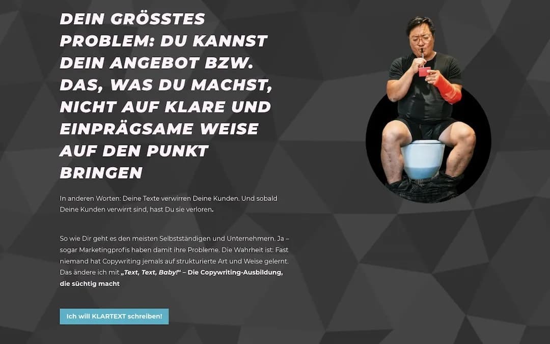
Here, visitors are shown with crystal clarity what their current problem is. That matters, because it's the only way to be sure your visitors know it too. Bringing the problem to the surface makes visitors want to solve it.
This is where the next part comes in:
How to create solution awareness on your sales page:
Now you make it clear to your visitors that there is a solution to the problems you have named. The important thing here is to build the solution directly on those problems.
In general, it's hugely important that your whole sales page reads like a story and not like a collection of random elements.
Visitors should always feel as though they are following a common thread.
You create solution awareness by presenting your product as the answer to the problem. The modules of an online course are one example:
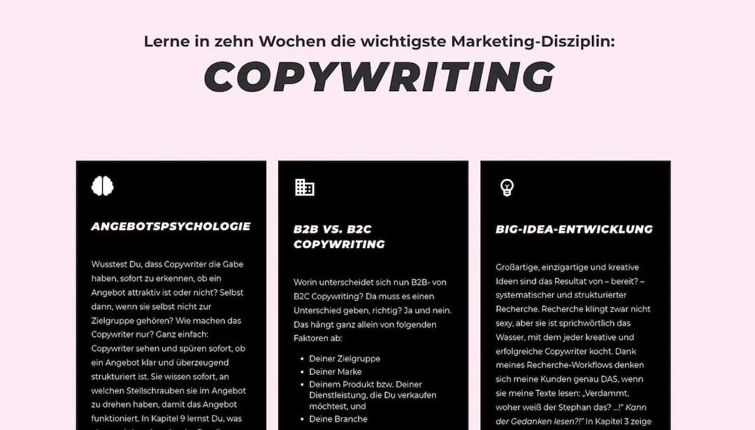
How to give your visitors real value on your sales page:
It's important to give your visitors real value, so that they have their “aha moment” and realise that the product is exactly right for them.
You do that by giving them a few tips that fit the product. If your product is an online course on losing weight, for example, share a few small tips on the best and easiest ways to lose weight.
That helps visitors understand that you know what you are doing. And they're pleased about the new things they have just learnt, especially if they hadn't come across these tips before.
That, in turn, gets them to spend more time on your sales page. The more time they spend there, the more likely they are to buy.
How to build trust on your sales page
Before you make the final pitch for your product, it's extremely important to build trust. A mix of video testimonials from your clients and written testimonials works well here.
It's really important to stick to a limited number of your best testimonials. In other words, 5 high-quality testimonials are better than 200 that nobody cares about.
What sets a high-quality testimonial apart is that it stirs emotions in the people reading or watching it.
That usually happens when people recognise themselves in the testimonial. When you collect testimonials from your clients, make sure they roughly follow this structure:
- What was it like before they had your product?
- What is it like after using your product?
- How did your product contribute to that?
The more your visitors can identify with the situation before your product, the more likely you are to sell.
In this section, place your three best video testimonials, for example:

and your 5 best written testimonials in a slider. The first one should be the very best, though:
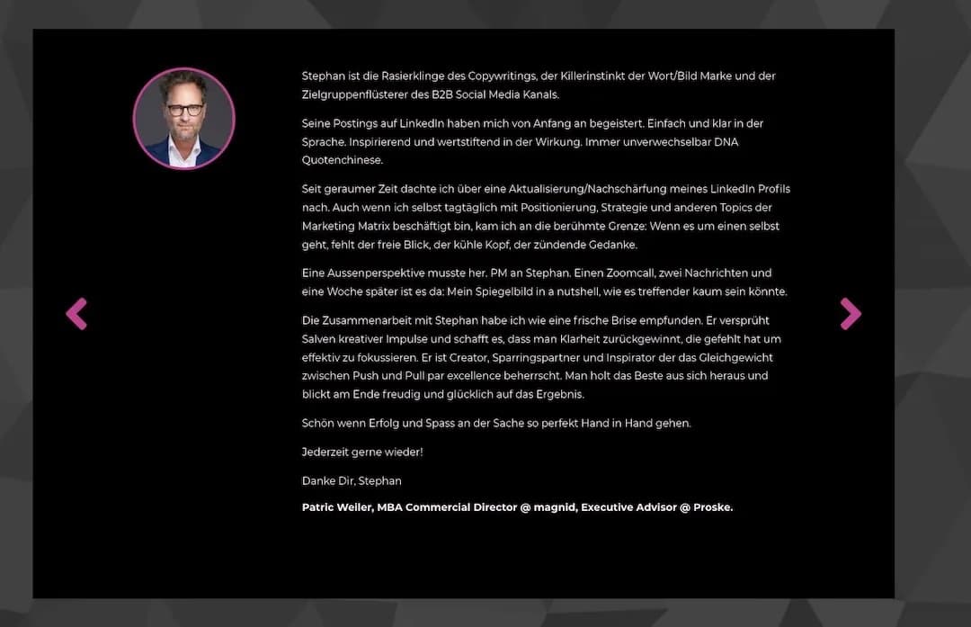
It's also really important to show the full name, a photo and the company. If your clients don't agree to that, leave the testimonials out. Shortened names don't come across well. People buy from people.
Also leave out any testimonials that consist of just one short sentence, such as “Great to work with, would do it again!” or “Everything was great. I can only recommend XYZ.” Testimonials like that don't build trust.
The CTA on your sales page: only now comes the offer
Once you have ticked off all the other points, you can finally present your offer. By now your visitors are warmed up, they trust you, and they know what their problem is and that you have the solution.
Here too, it's best to be completely straightforward!
That means you make it clear what the offer includes and what it costs, and ideally you answer a few questions in advance.
It also works best to have 2 or 3 different price tiers here: a cheap package, a mid-range one and an expensive one.
That way the cheap one can look like a bargain, for example, and it doesn't seem as expensive as it would on its own.
After your pricing packages, it's a good idea to pre-empt a few more questions or potential concerns your visitors might have.
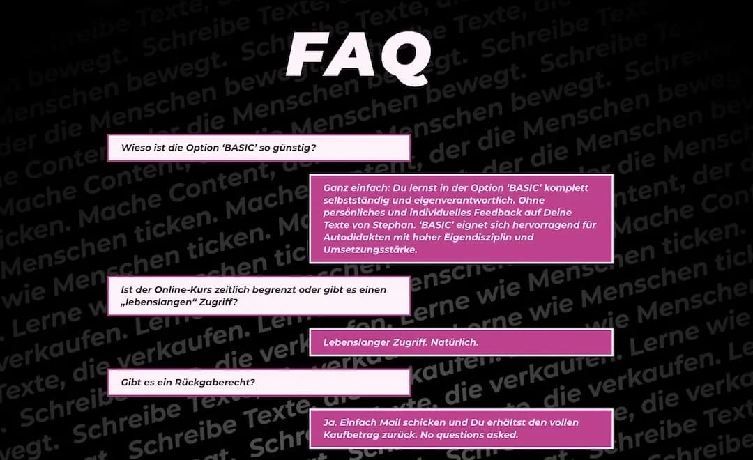
An FAQ section is one way to do that.
It is really, really, really important to have another CTA at the very end of the sales page that leads back to your main CTA, in other words the offer.

If you forget this, there's a good chance your visitors will forget what they're actually supposed to do here and simply leave.
To create a successful sales page, you can now use the structure above and pick a website builder to build it with.
Sales pages: the bottom line
If you want to sell or promote your product, whatever you do, don't just wing it with whatever comes to mind. That doesn't work. Take the time and follow the points above to make sure you build your sales page in a way that sells. The time you invest pays off many times over. With optimised sales pages you can increase conversions exponentially compared with bad sales pages that are built without structure or psychology.
[AD]
No idea where to host your sales page? Or where to buy your domain? I often recommend IONOS to my clients. Go for it: https://acn.ionos.de/SHHy *
* = This is an affiliate link. I receive a small percentage of the revenue if you book via this link.
