
Case study, Building technology / Building services design
Laurens Höveler

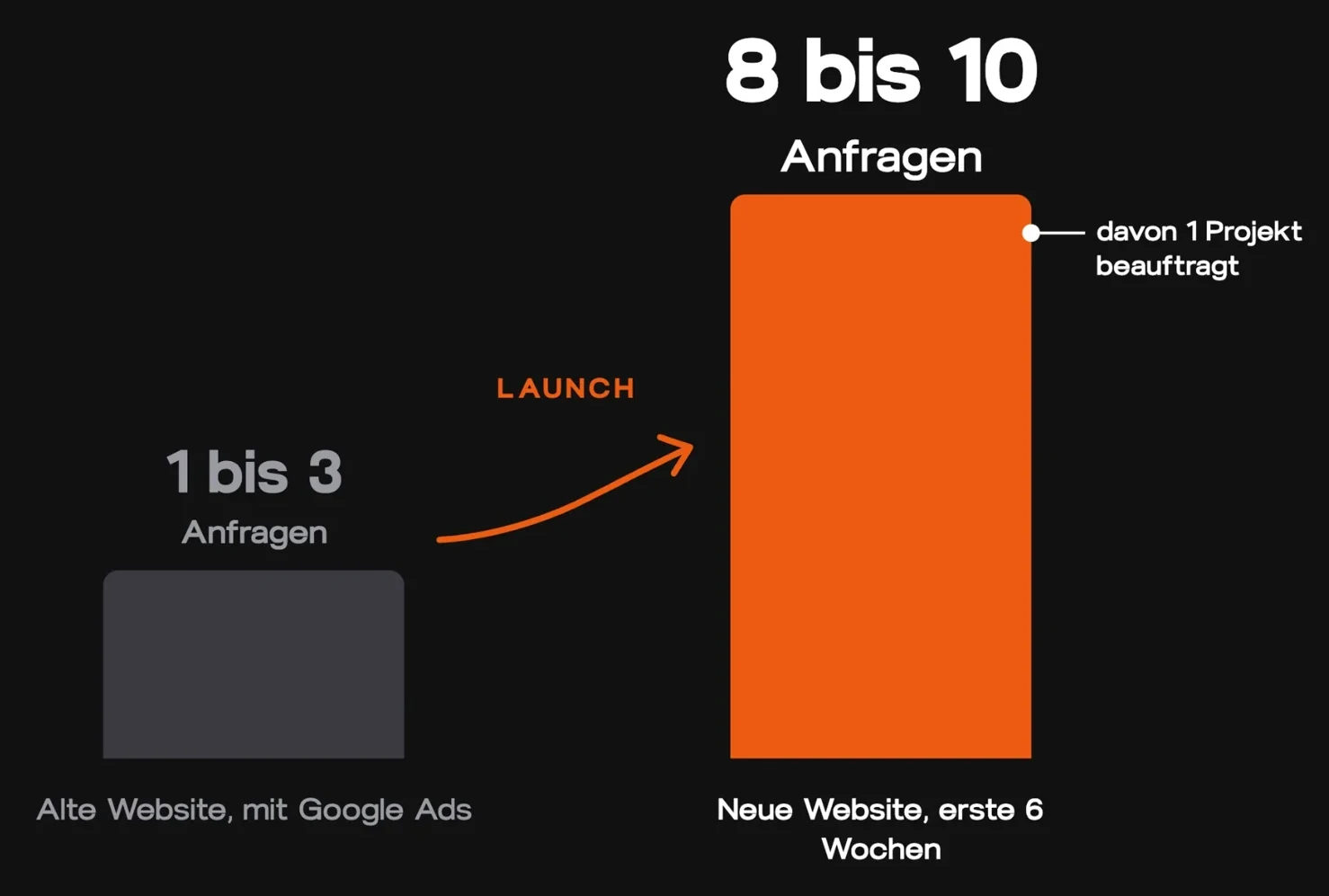
From 1 to 3 enquiries a month to 8 to 10 enquiries in 6 weeks.
Enquiries in the first 6 weeks after launch. Before: 1 to 3 a month, never reliable.
Net for the first commissioned project. That alone already covered the return on investment for the website.
On top of that, from a further contract won via the website.
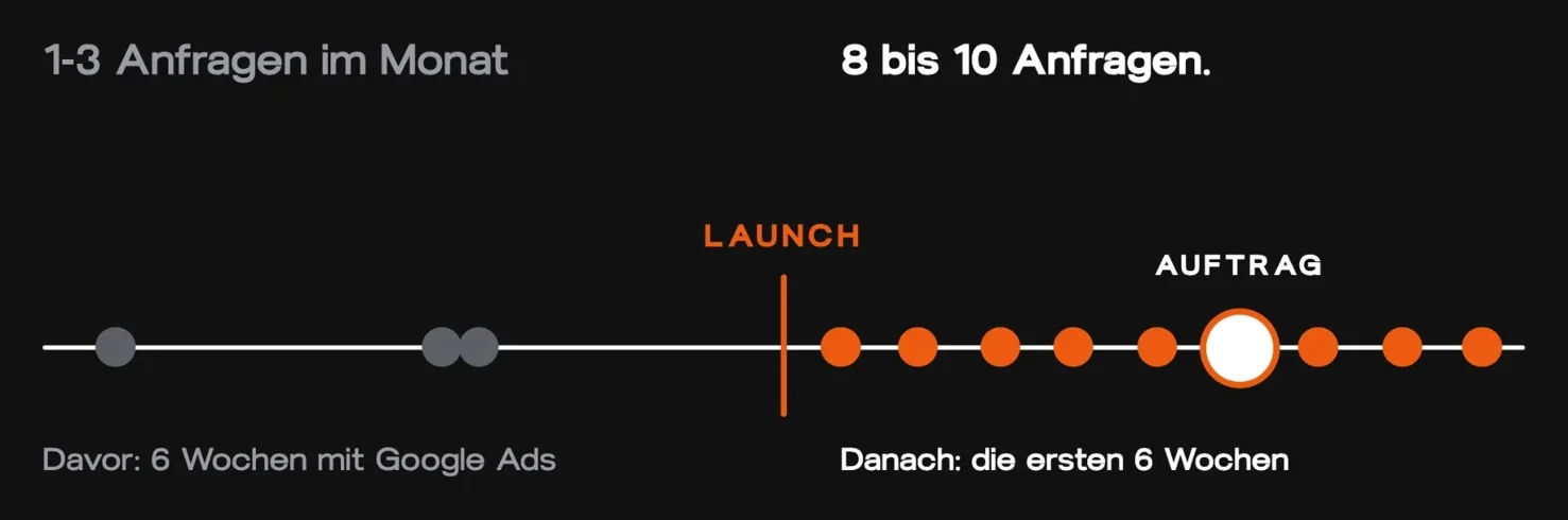
In the first six weeks after launch, eight to ten enquiries came in, including a project commissioned straight away.
1 to 3 enquiries a month. Never reliable.
- No references and no current projects on the website.
- Google Ads were running, enquiries weren't coming.
- Vague headline: “Ihr Projekt, unsere Vision” (“Your project, our vision”). No keywords in the H1, no mention of the location.
- Nothing to build trust with strangers: no client logos, no Case Studies.
- The website didn't show what the firm can do. It just ticked along on the side.
The new website, section by section.

- 01
Hero
In the hero we cover four points: absolute clarity, trust, emotion and a CTA. The headline is crystal clear: reliable planning office for building services. It doesn't sound cool, but Google, AI and leads understand straight away what it's about. Add to that the location, the client logos and a CTA that names the desire: I'd like to discuss my project.
- 02
Demarketing
We say straight away who we don't work for. Anyone who falls into one of the categories thinks: yes, that's us. That brings in the right enquiries and no bullshit enquiries.
- 03
The services
All the services, each with its own copy, and TGA planning is in the headline. People see straight away: yes, that's exactly what I need.
- 04
Everything is coordinated
What annoys people about the competition is that they're hard to reach and deadlines get missed. We show that L2 TGA coordinates everything, that you have one single point of contact and don't have to worry about anything else.
- 05
Case studies
Projects with images that show what they've already delivered for others. That triggers the effect: if they've managed it for them, they'll manage it for us too. The old website didn't have a single Case Study.
- 06
Building categories
Which buildings can we help with? New builds, existing buildings, flats. We're building a yes ladder the whole way through: yes, that's what we need. Yes, I'm in the right place.
- 07
What L2 TGA does differently
A fixed point of contact, planning with the building site in mind, deadlines that are met. Exactly the things people find annoying about other TGA planners.
- 08
About us section
To build a connection and get to know the company. Here too, we deliberately use keywords that make sense.
- 09
Current projects
A project showcase with ongoing projects in and around Düsseldorf. That builds trust again, and Laurens actively uses it in his sales conversations.
- 10
Trust section
All the companies L2 TGA has already worked with, at a glance. Anyone who sees that thinks: we should be working with them too.
- 11
The final CTA
Name, email, message, plus phone number and email address. Here we make the call to action very clear: let's talk now.
- 12
The map
Not a standard Google Maps embed, but a custom map with a headline: TGA planning office in the Düsseldorf area and NRW. That makes the location visible to the machines too.
- 13
FAQ section
This is where we place keywords and pre-empt objections: what does TGA planning cost? What happens in the first call? Do you only work in NRW?
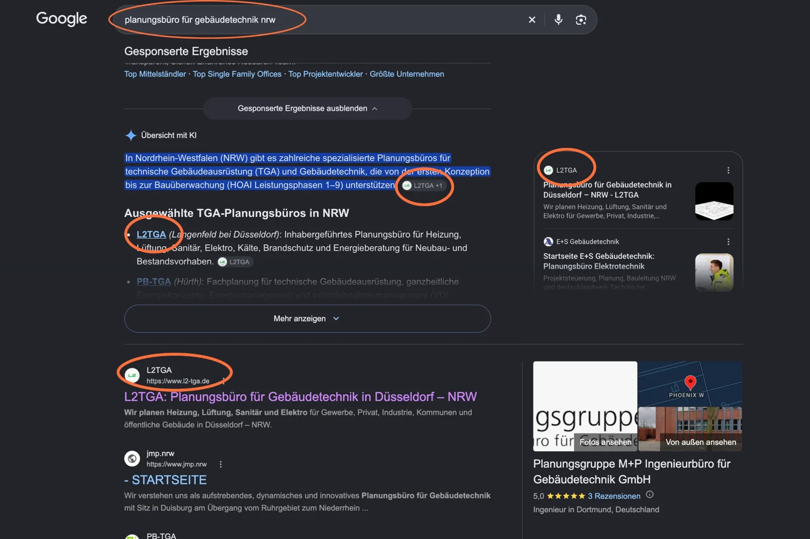
L2 TGA gets found via Google and AI.
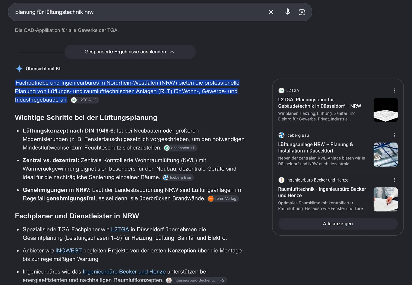
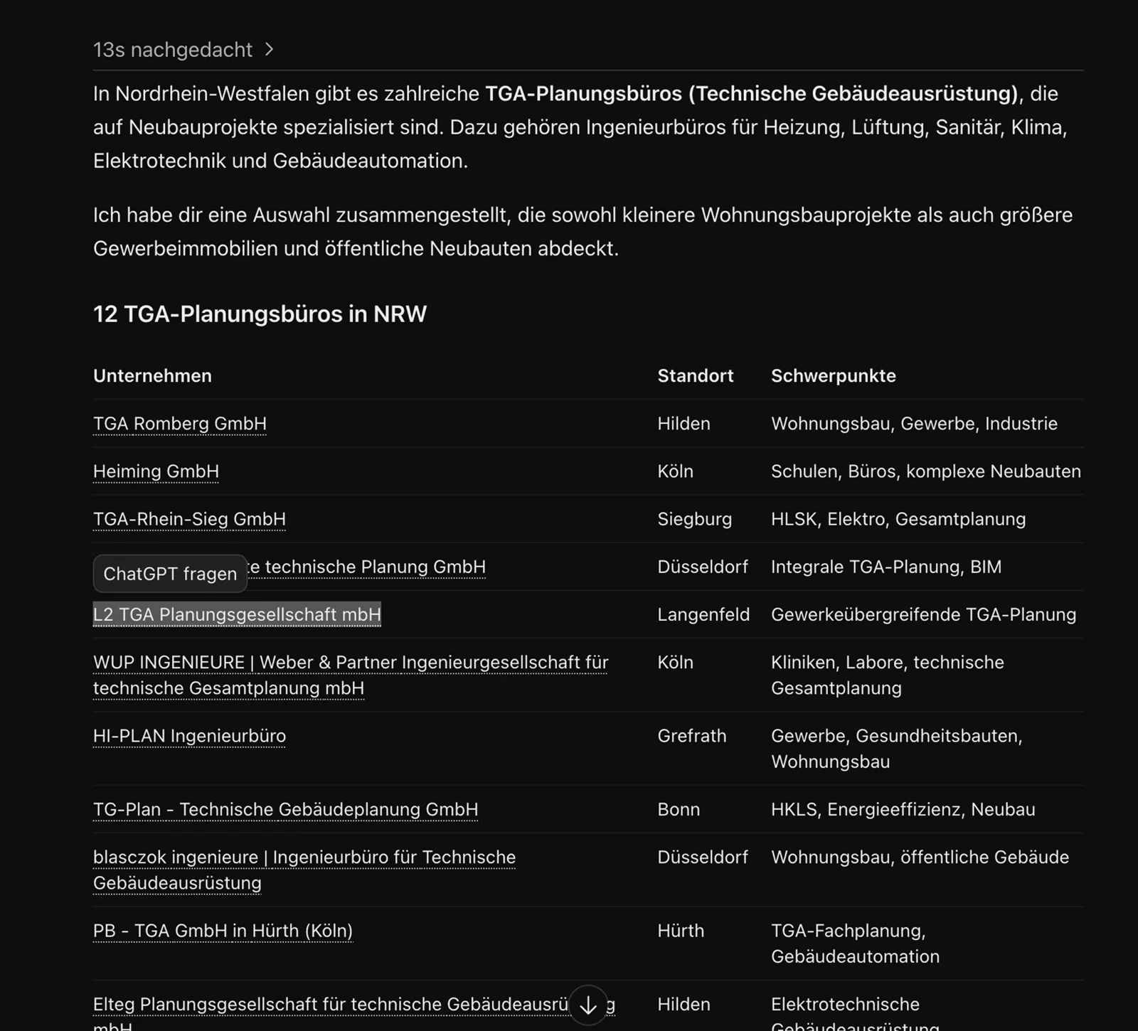
We put the keywords in the headlines: planning office for building services, TGA planning, Düsseldorf, NRW. That's why L2 TGA is named first on Google and gets specifically recommended by AI.
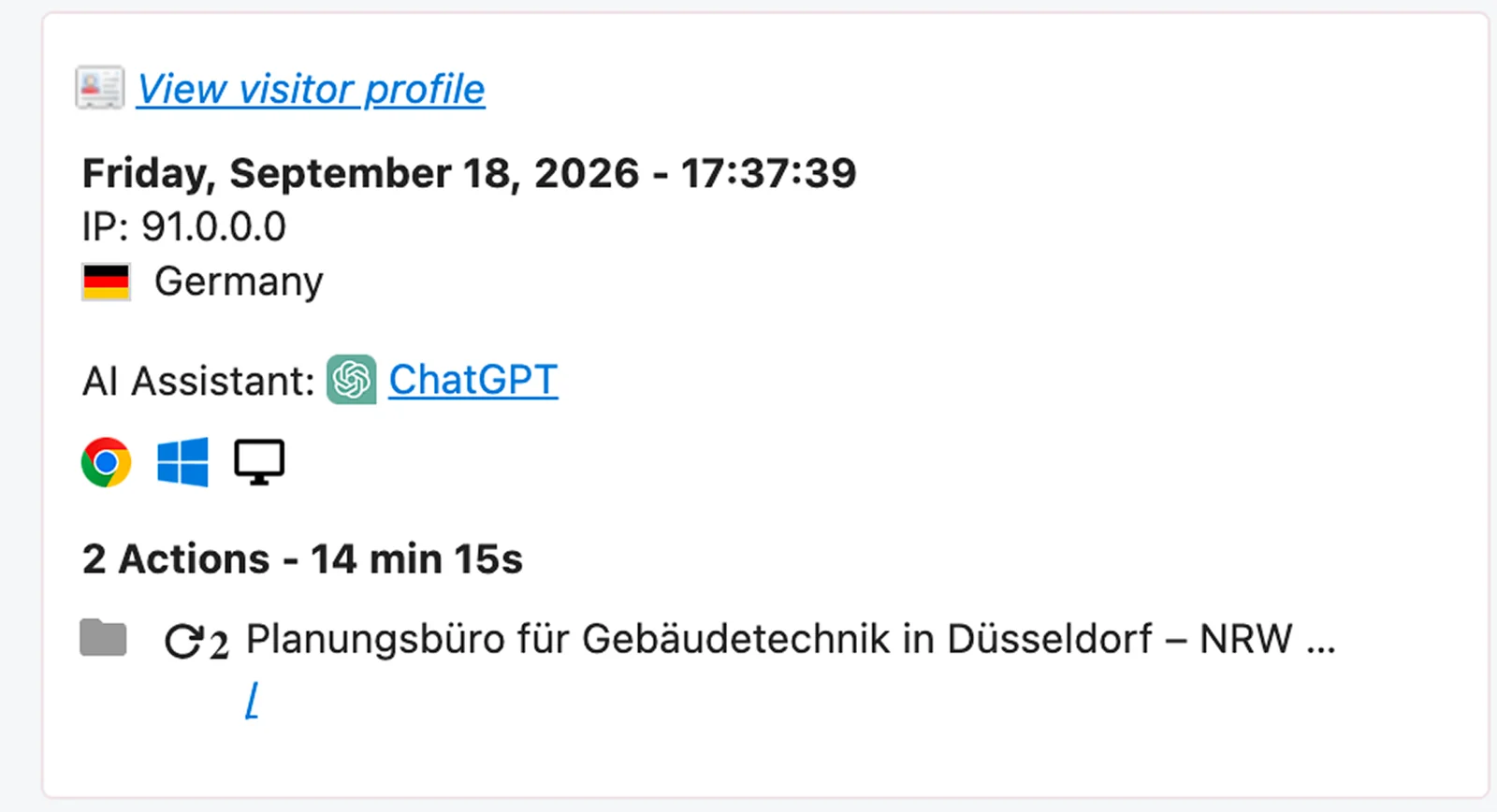
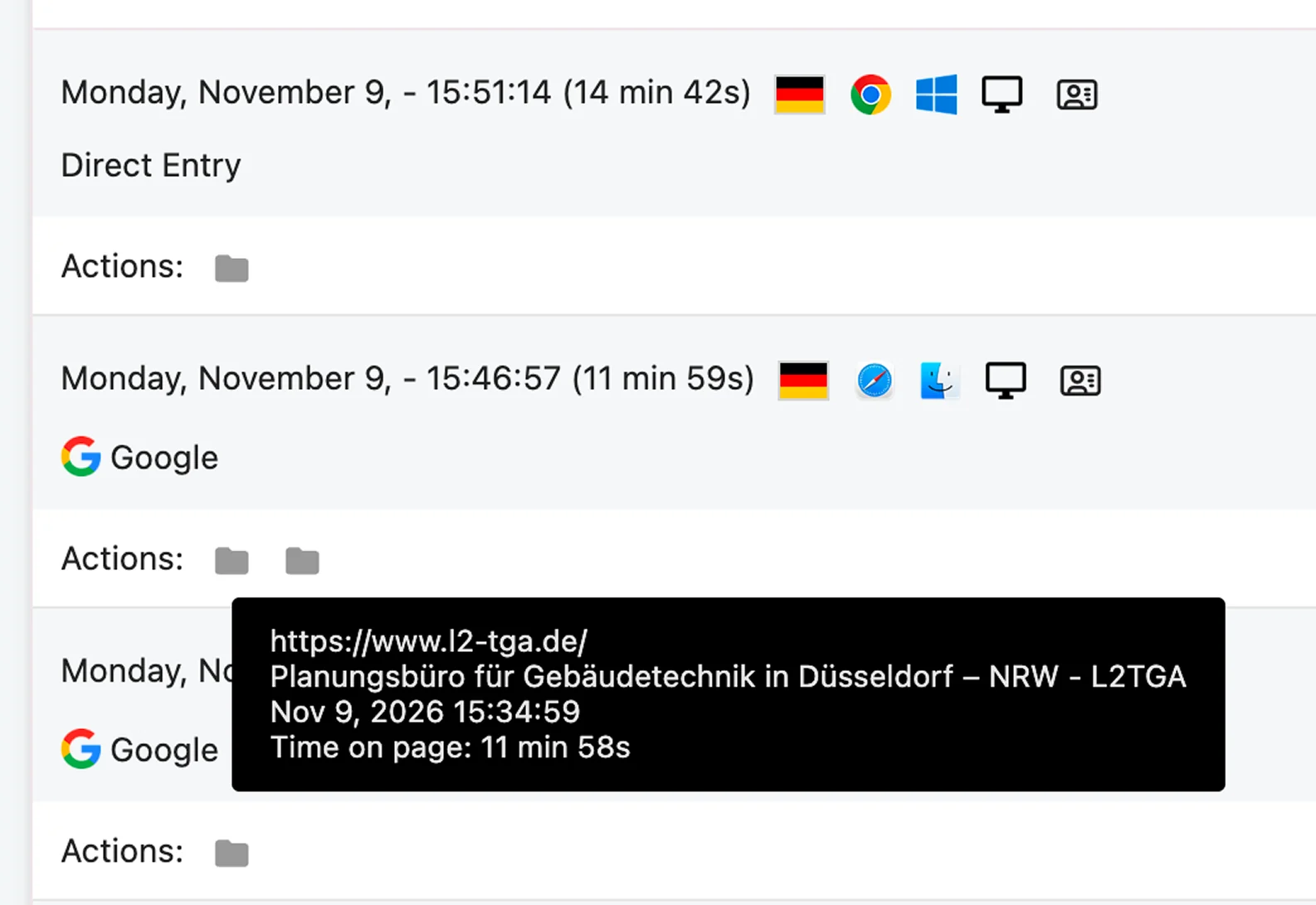
The client has since switched off the Google Ads. He still gets a steady flow of enquiries. And anyone who comes to the website from AI spends a really long time on the page, because they have strong search intent.
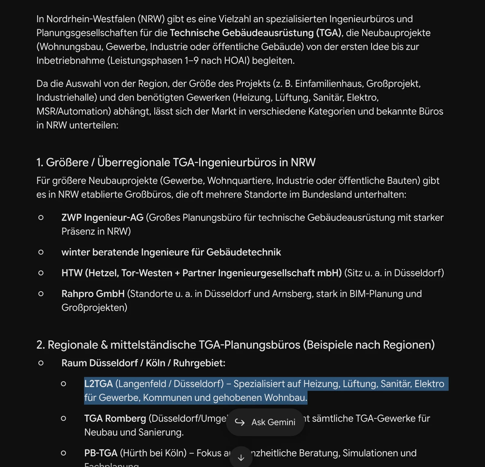
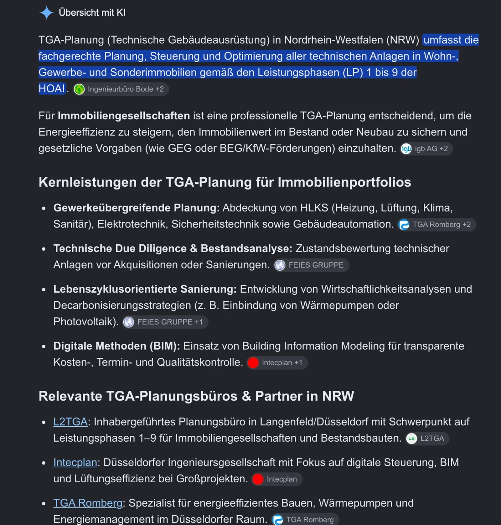
How we pulled this off for L2 TGA Planungsgesellschaft mbH .
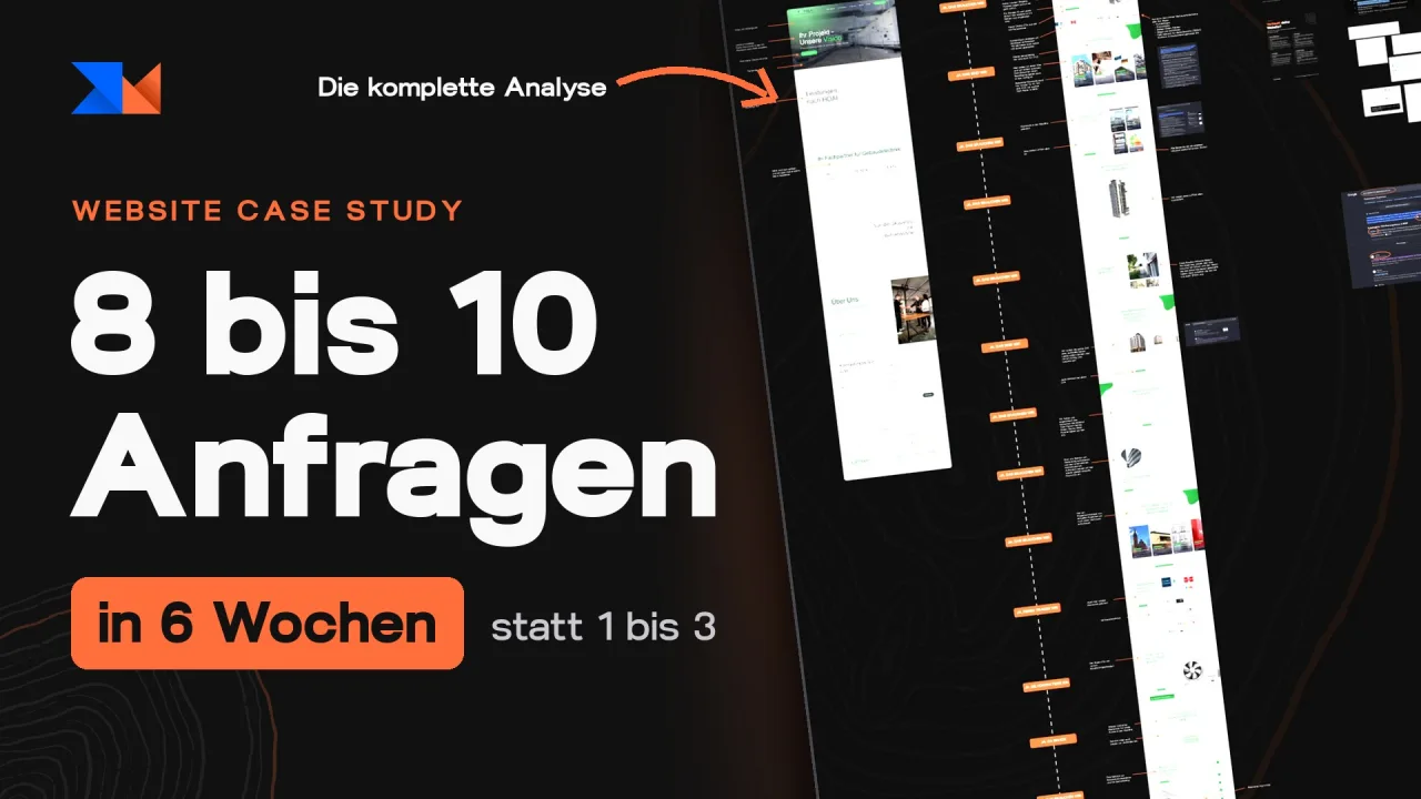

„In the first six weeks after launch, eight to ten enquiries came in, including a project commissioned straight away.“

Steal this value:
- 01
The headline says plainly what it's about
Don't try to be creative or cool. Say what you offer in 7 to 10 words, and show service and location in and around the H1.
- 02
The CTA names the desire in the first person
Not “Get in touch”, but the desire: I'd like to discuss my project.
- 03
Build a yes ladder
Every section triggers: yes, I need that. Yes, that's me. Every section ends with a CTA, and you say clearly who you don't work for.
Frequently asked questions about the Case Study of L2 TGA Planungsgesellschaft mbH.
Before, it was one to three enquiries a month, never reliable. In the first 6 weeks after launch, 8 to 10 enquiries came in, including a commissioned project straight away for 12.000 € net, which already covered the return on investment for the website. Later, another 40.000 € came on top from a further contract won via the website.
Yes. Anyone who types “Planungsbüro für Gebäudetechnik NRW” into Google, for example, gets L2 TGA named first. AI specifically recommends L2 TGA too. The client has since switched off the Google Ads and still gets a steady flow of enquiries.
Four points: absolute clarity, emotion, a CTA and trust. On top of that, you explain in two to three sentences what you offer, so that Google, AI and leads understand it straight away.
“Ihr Projekt, unsere Vision” (“Your project, our vision”) sounds cool but says absolutely nothing. Use something that brings absolute clarity instead. It's fine if it sounds boring. It has to do its job: people understand straight away what this is about.
No. Scrolling in itself is never the problem. The problem is that most people don't design their website to be engaging. At L2 TGA, the average time on site across the whole year is 2 minutes 22 seconds, with over 1.800 visitors on a one-pager.
When a potential client lands on your website, they should be thinking the whole time: yes, that's what we need. Yes, that's us. Every section gives them a piece of information they can use to decide they're in the right place.
You say clearly who you don't work for. We never want to create a website for everyone, but the website for the right target group. That brings in the right enquiries.
Keywords go in the headlines. You mention the town and region several times, wherever it makes sense. In the hero you explain in two to three sentences what you offer. And you show all your services, each with its own copy.
A website that brings me qualified leads is what I need!
